I have a nice collection of Vintage Parker pens and a few vintage and older Parker Duofold pens. My Parker Duofold Senior (flat top) in Jade Green is the first REAL CLASSIC Duofold that I have owned and this was a pen that I was really longing for. Since I had it for almost a full year, I have been very happy with it especially knowing and wondering how many owners hands this pen has been through. I have been eyeing the modern Duofold pens and especially the larger Duofold Centennial. This pen really appealed to me because I do like pens with more heft to them and this pen seems to of have it.
I never seen the Centennial in person but I have seen it on the net for quite sometime now. The major drawback was the price of this pen!! The Duofold International was more in my budget but it is much smaller than I would like so I opted out of the pen. Most of you know that I normally do not buy a lot of brand new pens. I usually like buying used pens off of Zoss and Pentrace Green Board and occasionally from E-Bay. Even used, the Centennial goes for around and over $200.00
I took the opportunity and good fortune of buying this pen off of the Pentrace Green Board from our very own Tytyvyllus(Kurt H.) Knowing that there was no box or papers (I really do not care unless the pen is brand spanking new) this pen was one hell of a steal along with being the cheapest Centennial I have ever seen before. Shipping was super fast and I believe it was a week or so before Hurricane Katrina. The pen arrived in flawless condition and I was really itching to fill her up
Appearance/ Finish 4.5 out of 5
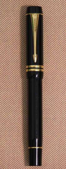
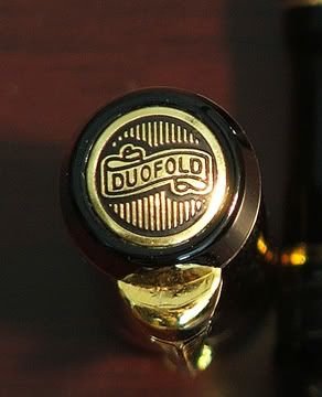
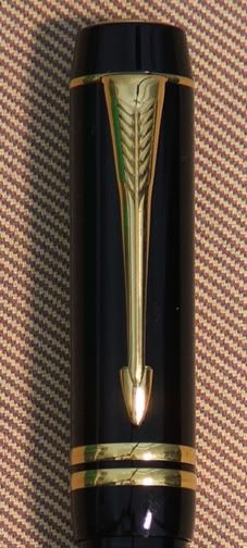
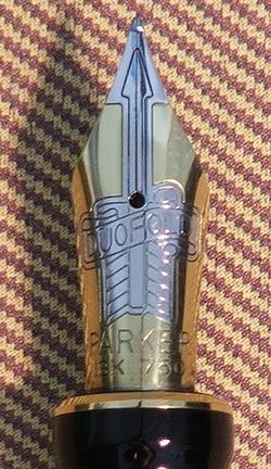
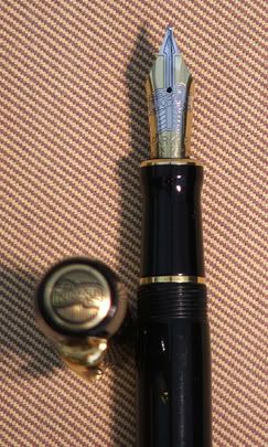
The Parker Duofold Centennial is in a modern black color with gold trim. The cap and barrel looks like it is made out of a high quality resin that seems to shine like the sun. No buffing is needed on this pen, that’s for sure. The cap has a gold arrow clip, 2 gold cap bands. On the cap tassie there is what looks like a coin made out of brass with the words “Duofold” in the older 1920’s style on a scroll. This gives it the marriage between the old vintage Duofold and the Modern ones.
The cap tends to slightly taper upwards from the clip band to the tassie. So this does not look like your classic Duofold flat top. This pen is aerodynamic looking with a nice modern flair to it. The section separates from the barrel by unscrewing with metal on non-metal threads. The section is about 50% plastic and 50% brass and seems extremely solid. Looking at the pen, towards the rear right below the faux blind cap, there is one thin gold band and the end of the faux blind cap is flat.
Design/Size/Weight 4.5 out of 5
I sort of jumped the gun and already gave you the details on the designs so I will go right to the size and weight. This pen is roughly under 5 ½ inches closed and about 6 ¾ in length with the cap posted. This is a pretty good sized pen with a comfortable heft to it. This pen weighs more than I thought it would and looks are deceiving when it comes to this pen. I believe the brass section provides a good amount of the weight of this pen.
If you find this pen to be too big for you, you can always opt for the International Duofold. The International barrel and cap is 1/8 smaller in diameter and the nib is also 1/8 smaller and also a bit cheaper too!!
As for the balance, with or without the cap, the pen feels nice and cozy with no obstruction that I can report. Due to my grip, the barrel threads do not interfere because I really choke up on the pen when I write. This is a nice comfortable pen with the weight in the right spot, at least for me that it!!!
Nib Design and Performance 4 out of 5
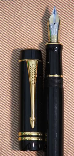
The nib design I believe is the most recent for the Duofold series to include the slightly smaller International and the big brother, the Centennial. The nib is made out of an 18KT gold nib that is two tone in color. There is the traditional arrow on the nib and also the words “Duofold” in the classic text on the scroll, kind of like the cap tassie. The nib looks very classy and has a bit of vintage feel to it. Under the arrow fletching is the trademark works “PARKER’ and under that is the usual data “18k 750” This is a really nice looking nib and I have to say that I was quite impressed.
Ok, let’s see how the nib and pen performed. I did buy this pen with a fine nib and I normally buy pens in the Medium and Broad widths. So this might take a tad bit of getting used to. This nib seems very stiff with little to no spring to it. I found that the nib is a tad bit scratchy for my tastes and the ink flow was extremely stingy but there was ZERO skipping. This pen was on the light to medium end of a Fine nib. So to remedy the situation, I made a few small modifications of this nib. I increase the ink flow and slightly opened the tines because they were pinched very tightly. So I was able to floss inside the tines using a Mylar 1.5 micron smoothing disc and then finishing it off with the .1 micron disc to polish the insides the tipping material. After about 30 minutes of work, this pen wrote on the light to medium side of a medium nib. The ink flow was extremely generous without being too much or too little. This nib is now perfect for my writing style and uses. Even though this is still a stiff nib IMHO smoothing the nib out and increasing the flow of in really made a big difference. This pen went from a good writing pen to a fantastic writing instrument.
The Filling System 4 out of 5
Wow, when will they listen to the consumer and construct more integrated filling systems? Oh well, you guessed it, Cartridge/Converter filling system. Parker pens (modern) use a propriety cartridge and converter. Both the cartridge and converter seats firmly with the brass section around it. No real issues with the actual filling process, everything went as expected.
Cost 5 out of 5
Besides performance, this is the next important thing I look for in a fountain pen. Since I did buy this pen used, the price of around $150.00 is a pretty darn good deal and I have yet seen one this sweet since I bought the pen. Now retail, this pen goes for around $288.00 brand new from Swisher pens. IMHO I think that is too steep of a price for this pen. If you want this pen then I would suggest to wait for a used on to go for sale on the Green Board, Ebay or whatever. If I were to rate this pen as if it was new, I would be honest and give it 3 out of 5 on the Savage scale. As for what I paid for, I give this one all fives (5) Great deal and worth the duckets!!
Conclusion
I have to admit that this pen is a pleasure to use and the balance and weight is very good. Parker paid attention to detail when it came to the nib and the cap tassie. The weight and material the pen is made out of, it really conforms to the hand. As I said earlier, this is the marriage of the old vintage with the contemporary modern. Should you buy it? That is up to you!! I happen to like it but I will not give it a “must buy” rating but I will give it high enough marks. So you should at least look into it.
3 comments:
how much was this pen?
Brand new pens e-shop here
http://www.exclusivepen.eu
http://exclusivepen.blogspot.com/
See you there !
My Duofold's nib is smooth out of a box for a fine nib (one of the smoothest f I have) and I like the moderate ink flow of the pen. I don't think a moderate/more restricted ink flow to be a flaw. I picked a Duofold against a pelikan for the ink flow.
I don't understand why majority of western fountain pen users like very "generous" ink flow. It is as if they never need to jump back and forth on the page occasionally and do not need to turn pages quickly. I use fountain pen exclusively for everything I write and my limit is western fine (not including pelikan) or Japanese medium. Because I need to use cheaper/thinner paper sometimes and many writing tasks requires things to be fit neatly and clearly between 2 lines of a notebook. I write not only English letters but also math equations, diagrams, Chinese characters, and many other things. Anything more than a fine would not be able to write things like math euqation without taking too much space. On a long day I use more than one long cartridge of ink with a "dry" fine nib so I believe I write with fountain pen intensively and I found a nib broader than a western nib inpratical for many daily uses.
Post a Comment