I saw this pen for bid on EBAY before but I have heard absolutely nothing about it other than it is called a Stipula Jerusalem Junem. The world famous Regina Martini is the seller and if you don’t know anything about her, then check out her web page http://www.martini.business.t-online.de/ Her specialty is Pelikan pens to include rare/limited editions, new and used. She can get just about anything you are looking for in regards to Pelikan pens. She also has & sells pens made for her from several different companies such as Sailor, DaniTrio and Bexley just to name a few.
Ok, so what in the world is this pen all about? From what I gather, this pen is made by Stipula especially for Jerusalem Pens http://www.jerusalempens.com/ located in, you guessed it, Jerusalem!!! Also there is another Jerusalem Pen Store in the coastal city of Tel Aviv Israel. David Elispur is the owner of Jerusalem Pens and they just celebrated the 5th Anniversary of the opening of his store. So to mark his important day, he got with Stipula Pens and designed a fountain pen that would commemorate the 5th Anniversary. According to David, Stipula is to release 2 series of 100 fountain pens each, so this will definitely be a Limited Edition/Special Edition fountain pen. Here is the story that is on the paperwork regarding this pen.
Junem By Stipula
In celebration of Jerusalem Pens’ five year anniversary, I designed a limited edition pen series consisting of two pens, one hundred pieces each, to commemorate this event. I chose to name the series JUNEM, which, in my parents’ mother tongue means “love of my life”. This symbolizes the true love of my life- my three daughters, Shai, Lee and Gull, my reason for being. The pen was designed with great care and under the supervision of Mr. Luca Viti of Stipula Pens, and promises to give you great enjoyment and comfort in use. It has a sterling silver cap, black body and 14kt gold nib, and is available in the sizes 52-XF-F-M-B-STUB. I hope Junem will be the first of many pens yet to come to mark other great occasions or feelings.
Enjoy Junem
David Elispur
His signature was handwritten on the paperwork; this gave it a personal touch to it, kind of like his blessings!! One of my questions is why Regina Martini is selling these pens rather than David Elispur? That I do not have the slightest clue but this will be something that I can email and ask Regina herself. If I do get that information, then I will revise the review to add it.
Appearance/ Finish 5 out of 5
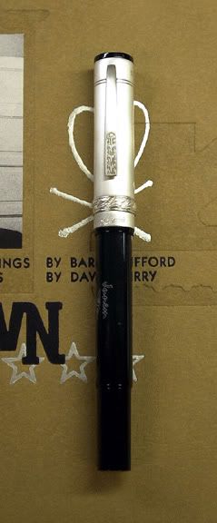
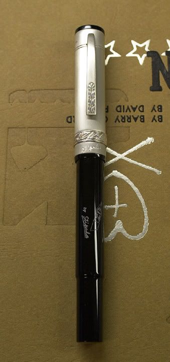
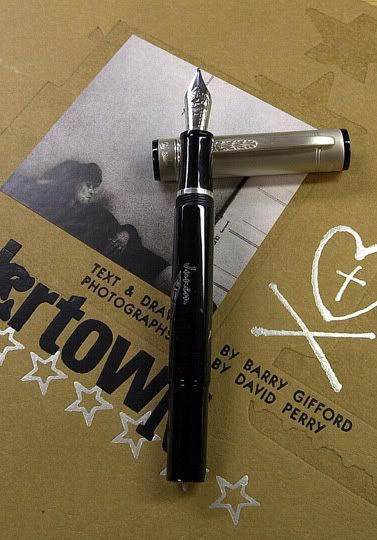
Like I said above, I really didn’t know what to expect with this pen. There really wasn’t any dimensions listed on the EBAY auction but I knew that Regina Martini is a well respected pen seller so I was pretty confident that I wouldn’t be at all disappointed. The pen arrived 1 week after payment and I was really surprised that it made it from Germany to California that quickly. I saved on shipping because I didn’t need the box but I did request the paperwork/warranty/instruction booklet. When I pulled the pen out of the box, I was really blown away with what I saw on this pen. The cap is a mixture of brushed steel and sterling silver. The top of the cap is flat with what looks to be an acrylic (jewel?) piece. The bottom of the pen has a brushed steel piece with the same material as the cap. The body of the pen looks like black acrylic polished to a very high gloss shine. This is a very sharp looking pen!!
Design/Size/Weight 4.5 out of 5
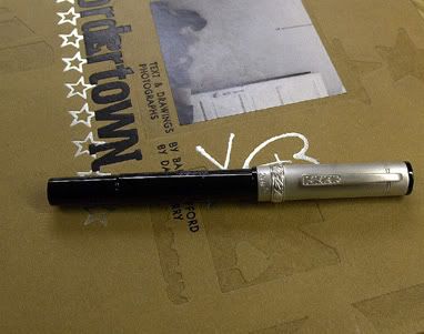
Hmm, let me see… How do I describe this pen? Ok I will go in to more detail regarding what was stated above. The length of this pen is right around 5 ½ inches capped. With the cap posted, the pen is just under 6 ½ inches in length. The girth of this pen is pretty darn close to that of a modern Sheaffer Balance II and a Pelikan M600. So this is not a small pen but then again, it isn’t huge either. This is what I would call a medium to standard size pen, especially because the pen isn’t that fat. It can rest very comfortably in most anyone’s hands to include small all the way up to big ol’ mitts!! The pen writes nicely while the cap is posted but it will write just as nice without it. I guess it all depends on your personal preference. The rear of the pen is purposely tapered so that the cap would fit snugly while the fountain pen is capped. This is something that I normally do not see all that often.
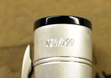
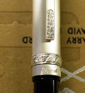
At the bottom of the pen there seems to be a metal jewel or tassie that is made out of brushed steel that says “Junem 051/100”. The barrel of the pen has the white imprint that reads “Junem” and right below that is line art of a fountain pen nib. Right below that has the words that read “By Stipula” Moving on, further up the pen, there is a silver ring that separates the section and the barrel. Thank goodness the ring is further up the section and away from the nib. Some pen companies like to leave the trim ring that close to the nib and unfortunately this really increases the chances of corrosion. So Stipula did well in that aspect of this particular fountain pen model.
The cap of this pen is made out of a combination of brushed steel and sterling silver. Surprisingly, this cap is relatively light especially due to the type of material that this cap is made out of. This pen has the Stipula trademark cap ring, the one with the straw and all that. I believe that the ring and the clip is made out of sterling silver while the rest of the cap is made out of the brushed steel. The clip on this pen has the straw pattern up 1/3rd of the way. The clip is spring loaded and it has a decent range of motion with a good amount of tension to it. Towards the top of the cap, which is a flat top cap, is the pen numbers from this special release. The numbers read the same as the bottom jewel, 051/100. The flat top is made out of the same acrylic as the barrel; this really compliments the rest of the pen.
One thing that I found to be quite interesting is that the rear of this pen has a bit of a subtle notch and then the diameter is reduced by a bit. The reason for this is so when you post the cap on to the rear of the pen, there is a perfect fit. There is very little pressure needed to post the cap on this area of the pen. Once it is there, it is really not going to come off until to add a bit of force by pulling the cap off. This is a feature that you really do not see on too many pens and if I remember correctly, Conklin did this with the modern vintage pen. Another thing that I find pretty cool with this feature is that it keeps the cap from looking like it is bulging at the end of the pen while you are writing. It gives it a more lower profile or streamlined effect.
Nib Design and Performance 5 out of 5
I was given the option of what nib width I wanted. The selection was XF-F-M-B-1.1 STUB. I decided to go with the wider stub 1.1 nib because I really enjoyed my Stipula 1.3 nib and this will be just a tad narrower. All the nibs are monotone rhodium plated 14kt gold that matches the metal on the rest of the pen. Unlike the standard screw out nib units made by The Bock Nib Factory in Germany, these are friction fit. These nibs are the same standard size as most of the nibs Stipula uses on its pens. It seems that the Monotone rhodium plated gold nibs are usually 14kt rather than 18kt on the two tone nibs. As far as I am concerned, 18kt gold nibs do not necessarily mean that the nibs have more spring or flex to them compared to the 14kt gold nibs. I used to be really bent on the higher the Karat gold nibs being better than the lower Karat gold nibs in terms of it having a softer feel, better spring, more flex and a better overall writing experience. This is really not true at all because, flex, spring, softness and smoothness are all things that are contributed by many other factors other then higher Karat gold. I found this to be the case with my Sailor 21kt gold nib versus my 14 karat gold Visconti Van Gogh Nib. I found that the Sailor was as stiff as a nail in comparison to the Van Gogh, which was extremely soft and has a wonderful spring to it. So with that said I can care less if Stipula opted with a 14kt gold nib rather than the traditional 18 kt gold nib.
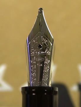
I think that the rhodium plated gold nib really brings out the silver in the rest of this fountain pen. So how does this nib perform? Pretty darn good!!! Since this is a 1.1 Italic nib or Stub or whatever you want to call it, the line width is on the broad side. Definitely not as broad as the 1.3 but still wide enough to be considered a light broad or heavy medium. The nib is a bit on the stiff side in comparison to the 1.3 but it is a pleasant stiffness to it. There is plenty of feedback while writing although this nib needed a slight amount of tweaking to it. The tines were extremely tight and the nib had a few skips here and there while I was writing. Also the pen was a little bit on the dry side, this nib was nowhere near scratchy, in fact it is rather smooth. To remedy the problem, I flossed the inside of the tines with a super fine Mylar nib smoothing disc while gently pulling outwards to lessen the pinch on the tines. This really opened the flood gates and caused this pen to really run a nice moderate amount of ink. This really changed the whole overall experience while writing. The skipping ceased while the ink really went from stingy to heavy in a matter of a minute or two of effort.
Now the pen lays down a solid amount of ink and is really a joy to use. The down stroke gives you a very nice juicy line while the horizontal stroke is as thin as a razor. The overall line variation is very remarkable along with the crisp and clean curves and strokes. Surprisingly, with tall of the line variation this nib offers, Stipula didn’t sacrifice the nib’s smoothness whatsoever. This is not as wide and smooth as the 1.3 but it is still a wonderfully smooth nib with just the right amount of width for character. Even though I prefer broader nibs, the 1.1 Stub is a bit more practical for everyday use versus the 1.3. This is due to the fact that you can write a bit smaller on forms without it being unreadable but still have enough juice for signatures. As for the fit, this seems to fit 90% of everyone’s hands. The pen is comfortable while writing and I have yet had fatigue in my fingers or hand. All in all this is a pretty comfortable pen to use and rather light too. You don’t have to worry about your shirt pocket tearing or sagging due to the weight of heavier pens.
The Filling System 4 out of 5
The filing system on this pen is a typical cartridge converter. Rather standard and boring but it suits this pen which is on the standard to slender size. Surprisingly, the cartridge/converter filling system keeps this pen on the light side even though there is a lot of metal on this pen
Cost 5 out of 5
This is where I made out like a bandit!! I placed my final bid on Christmas night around 1130 pm and I snatched up this pen for $145.00. Shipping was like $8.00 or so because I didn’t want to pay $15.00+ for the box and what not. I have so many pen boxes; I don’t know what to do with them. I see no need in paying the extra money for a box that is going to be packed away in my garage. As long as I got the pen and the papers, I am very happy!! I seen this pen sell for around $200.00 on EBay from the same person so for the most part I think I got a pretty good deal. One thing that this pen didn’t come with is a converter. I was a bit surprised that it didn’t come with it but I am sure it was probably an oversight and I have plenty of spare ones in my spare parts drawer. So I pulled out a Waterman and the rest was history. There was no way I was going to make a fuss over a lousy converter, especially when I have a bunch of spares. Now if it was the Stipula convertible piston or the special Visconti Converter, then I would raise a stink.
Conclusion
This is a special limited edition fountain pen from Stipula at a really killer deal. The pen looks classy and writes extremely well. The pen is really a pleasure to use and it is practical enough for daily use. Even though this pen was made of Jerusalem Pens in Israel, the only place I have seen this pen for sale is on EBAY from Regina Martini. This is a well priced fountain pen especially because it is a numbered limited edition. Would I recommend this pen? Absolutely!!! The workmanship is excellent with a look that is like a “classic meets modern” style. I am extremely happy and satisfied with this pen and if you like standard sized fountain pens, then I am sure you will like this pen. Two Thumbs up on the “Savage Rating System”
No comments:
Post a Comment