The Visconti Copernicus is a pen that I really wanted for quite some time and I found that it was next to impossible to find and if you did find one, it was way too expensive. This is the first Crescent filling pen that I really fell for. Although I bought the Stipula Saturno first, I was till longing for the Visconti Copernicus fountain pen. I found a few of them on line at Penopoly and there was no way I was going to pay $400.00 to $500.00 for one. I searched the internet and FLEAbay for almost 1 ½ years for this pen with really no luck up until Christmas Eve of 2005. During that time I must have bought about 6 or 7 pens due to the fact that people were not bidding as much as they usually do. So for me, this was the perfect time to do my EBAYing.
This pen was only dipped never filled. There were no traces of ink anywhere on this pen especially when I went to flush out the pen with cool water to test the filling unit. I don’t think the original box and packing material was included with this pen when it came to me from Asheville North Carolina. To me, it is a very minor issue, as long as the pen was in perfect shape, that’s what really matters to me.
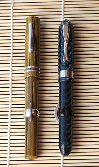
Another reason why I bought this pen is because I liked the material design of the Visconti Wall Street along with the Parker Vacumatics of the 1930’s and early 1940’s. This pen differs from the rest because of the classic Crescent filling system. Celluloid always seems to fascinate me especially with the countless number of designs that can be made using this material. The feel and look of celluloid is its own unique species and no other pen feels the same, even the modern acrylics.
Appearance/ Finish 5 out of 5
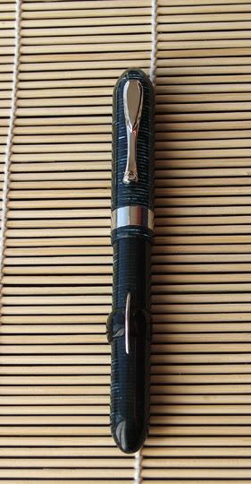
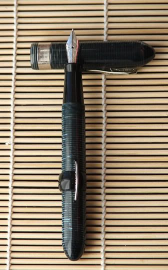
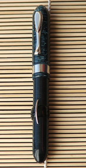
This pen is the blue and black striped celluloid style. The barrel, section and cap are brought to a “High Pro Glow” that is enough to blind you!! The cap band, clip and the crescent are a sterling silver finish. This gives a pen a wonderful classy looking contrast that is very pleasing to the eyes.
Design/Size/Weight 4.5 out of 5
The shape of this pen is a semi- cigar shape with a sleek aerodynamic design. The pen measures in at 5 ½ inches in length capped and if posted, it is a mind blowing 7 ¼ inches long. The diameter is 1 3/4th inches, the girth is very comfortable and isn’t too wide for most people. I would call this pen a large to under an OS sized pen, if that makes any sense. As far as balance goes, this pen writes just fine without the cap being posted. If you have large hands or you just like long pens, then posting the cap might be right up your alley. One design flaw that I saw that was a bit irritating is that the cap is pretty hard to post and it takes a bit of pushing and rotating to get the cap to seat properly while posting. So I normally do not post this pen because it is large enough and balanced enough without the cap. Plus I do not want to damage the cap due to putting too much pressure to keep the cap posted. The weight of this pen is not as heavy as the Stipula Saturno so it would be safe to say that this pen weighs around 1 oz to 1.1 oz.
The materials on the Crescent, cap band and clip seem to be made of sterling silver. On the rest of the pen, I believe it is Celluloid Acetate, I don’t smell any of that wonderful camphor smell. The design of the celluloid is the same as the Visconti Wall Street and Manhattan. The Copernicus has the same pattern as the Earlier Parker Vacumatics of the 1930’s and 1940’s. The Clip is spring loaded and is the same clip used on the Visconti Manhattan. It is a pinch type of clip that allows you to press the top of the clip and it will release the tension so you can easily remove the pen from your shirt without the worry of ripping it. The end of the clip has a bit of flair to it which really gives it a vintage look.
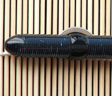
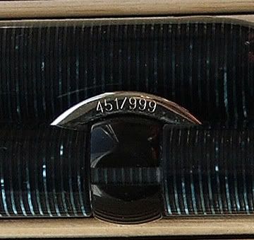
The cap band is about 1/4th wide with the words “COPERNICUS” written around the band. On the Crescent filling mechanism there are the numbers 451/999. Since this fountain pen is a limited edition of 999 fountain pens in each color, this pen is #451. I believe that the Copernicus was released in 1996. One thing that I didn’t like was the use of a plastic or celluloid safety ring for the Crescent filler. The safety ring prevents the crescent form being accidentally pressed down, causing ink to discharge out from the nib and feed. Stipula did a really nice job with its safety ring by making it out of sterling silver and also giving it sleek and clean look to it. Stipula sacrificed weight for style but I would have preferred the extra weight for the sterling silver ring. This safety ring only turns a maximum of 90 degrees while the Stipula freely turns around but with enough tension to prevent the ring from inadvertently moving to the open position. Plus with metal on plastic contact, the plastic will always lose!! So that’s why I would have liked to see a metal safety ring used instead of the plastic or celluloid one.

I read that the Sister pen, the Manhattan was created using several hundred sheets of celluloid alternating to give it the striped look. So as the Manhattan used the alternating sheets of celluloid, so does the Copernicus and the Wall Street. This really gives the pen a wonderful vintage feel to the pen and that is what really attracted me to this pen in the first place. The section if made out of acrylic or celluloid, I really cannot tell but it is a solid black color that seems to go with the rest of this pen. The thing I find really neat is that this pen is Semi-transparent. If you turn the pen just right, you can see the out line of the pens guts. Kind of a neat feature that you don’t see on pens everyday!!
Nib Design and Performance 5 out of 5
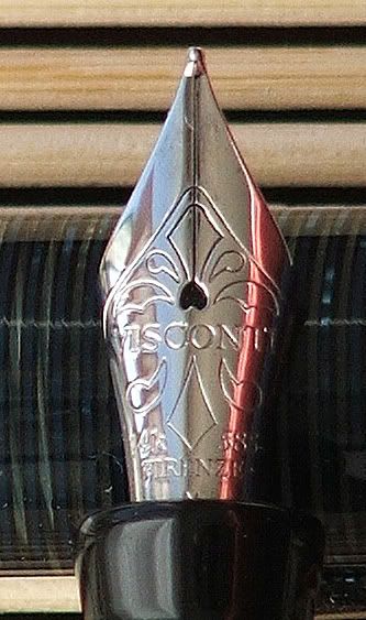
It looks like Visconti used its older style 14kt gold monotone nibs for this pen. I guess that back in 1996, that was the standard sized nib compared to the nibs they are using today. This particular pen uses a rhodium trim throughout the crescent, cap band, clip and the nib is rhodium plated. I happen to like rhodium and sterling silver on my fountain pens more so than gold. Rhodium give a clean and sterile look to fountain pens and sometimes I feel that Rhodium is more appropriate than gold. Rhodium is less gaudy than gold and it gives the pen an overall feeling of a business orientated person.

This particular nib is 14kt gold rhodium plated medium width nib. The flow on this pen is about as perfect as you can get. I prefer wet writers but this gives me enough juice to comfortably work with. The breather hole is “heart” shaped and it provides enough air to keep the ink flowing well. I have to admit that this pen has yet to skip and it provides a lot flow to keep up with my fast writing. I believe the feed is made out of ebonite. It has a rubbery feel to it when I run my finger nail across the feed while it is saturated with ink. This has a much different feel to it than the plastic feed does.
The Filling System 4.5 out of 5
This pen uses the crescent filling system that was introduced by the Conklin Pen Company in 1901. Filling the pen is extremely easy and I find that this pen holds a boat load of ink, more so then the lever filling fountain pens that I have used. The main complaint from people is that they cannot get used to the location of the Crescent while they write. I have no problems writing with this pen and I find it rather comfortable to use.
Cost 3.5 out of 5
Big money!!! Or at least I thought. Since this pen is usually starting at the $400.00 mark and the selection is far and few between due to the fact that this is a limited release from 1996, beggars cant be choosers!!! Well after almost 2 years of searching, my search was over when I saw it for auction on FLEABAY. The pen started at $150.00 and I had the winning bid at around $220.00 plus $10.00 inflated shipping. This is still almost $180.00 cheaper than I have seen anywhere else. There is no way I would have ever bought this pen for more than $250.00. In fact that was my limit on my EBay bid so I lucked out and got it for much less than I anticipated. The price I paid was definitely a Sumgai deal but I really think the Pen gods found favor in me or they must have felt sorry for me. Both way, a good deal is a good deal and I will take it anyway I can. $220.00 was a lot cheaper than I thought and I feel good about fulfilling my quest for the Copernicus, especially in the color that I wanted!!
Conclusion
So let’s wrap this up with the conclusion!!! This is the pen that I wanted for quite sometime and I got it at a price that was much lower than I was willing to pay!!! The pen has a classic turn of the century design with the celluloid colors from the 1930’s and 1940’s. This pen has enough looks to where the modern fountain pen collector would find interest. It has the vintage feel to where vintage collectors might find a place for this pen in their collection. I am extremely happy with the performance and feel of this fountain pen. This pen is not only a looker but it is also a performer that will not disappoint. As with all crescent filling fountain pens, make sure you are comfortable using them before you shell out the big bucks. I am sure that a B&M store that carries a Conklin Mark Twain with Crescent filler would allow you to try out the pen for comfort. If it does appeal to you and the placement of the crescent doesn’t bother you, then this might be a pen for you!!
1 comment:
Nice. I didn't know Visconti made any crescent fillers.
Post a Comment